Social Platform
Web Design
Usability Testing
Through testing key user journeys, we uncovered critical issues affecting onboarding flows (unclear process indicators), genre navigation (missed menu options and limited search functionality), and shelf organization (inconsistent terminology causing workflow confusion).
Our design recommendations included progressive disclosure navigation, enhanced search filtering, and unified terminology systems to create a more intuitive book discovery experience.
Timeline
Mar. 10 - 31, 2025 (3 weeks)
My Role
UX/UI Designer and Researcher
Skills
Interviews, User research, Usability testing, Qualitative Research, Affinity mapping, UI design
Team size & Members
3 UX designers (Me, Claire Jen, Roshni Ganesh)
background
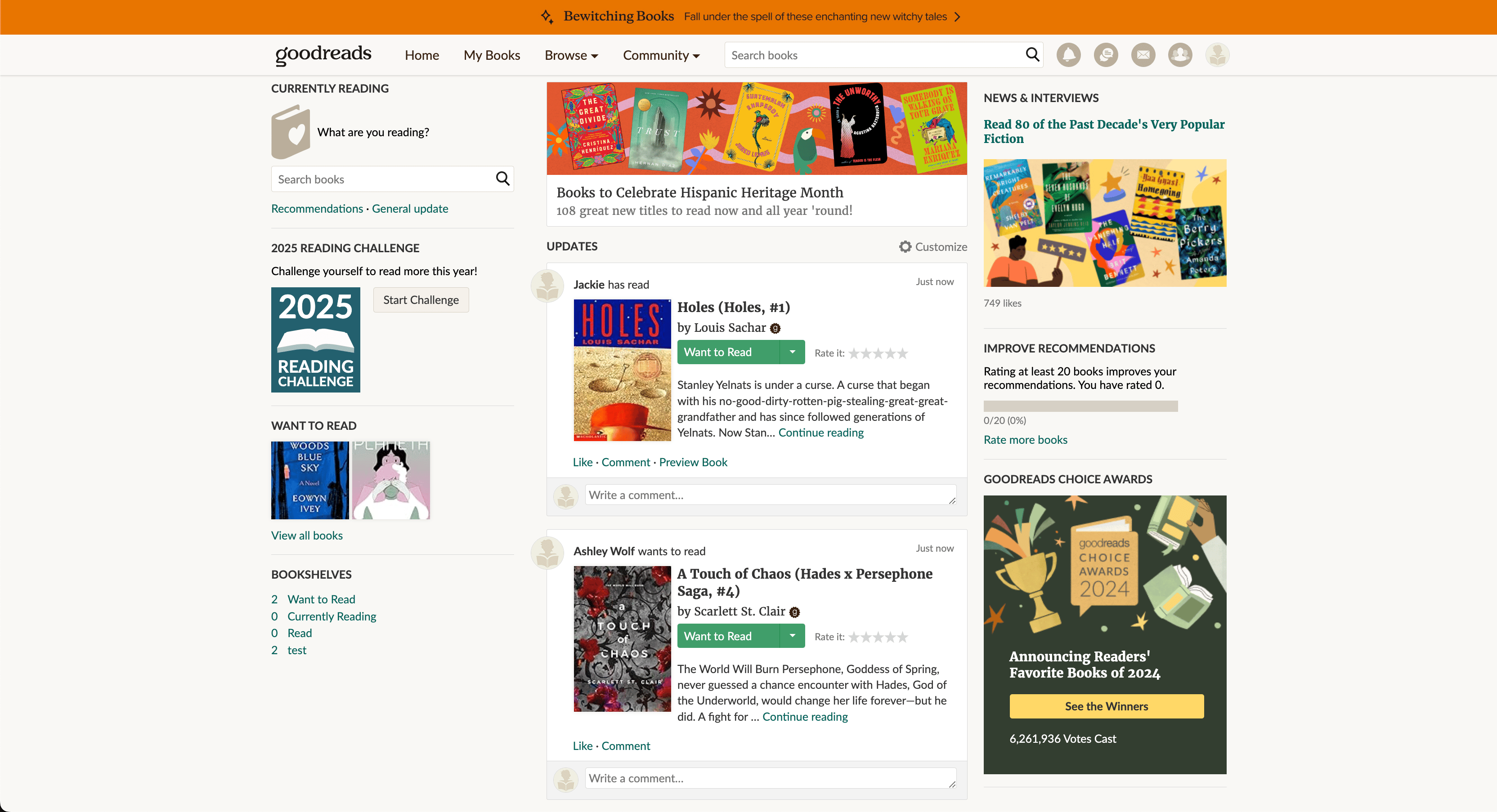 Current Home Page
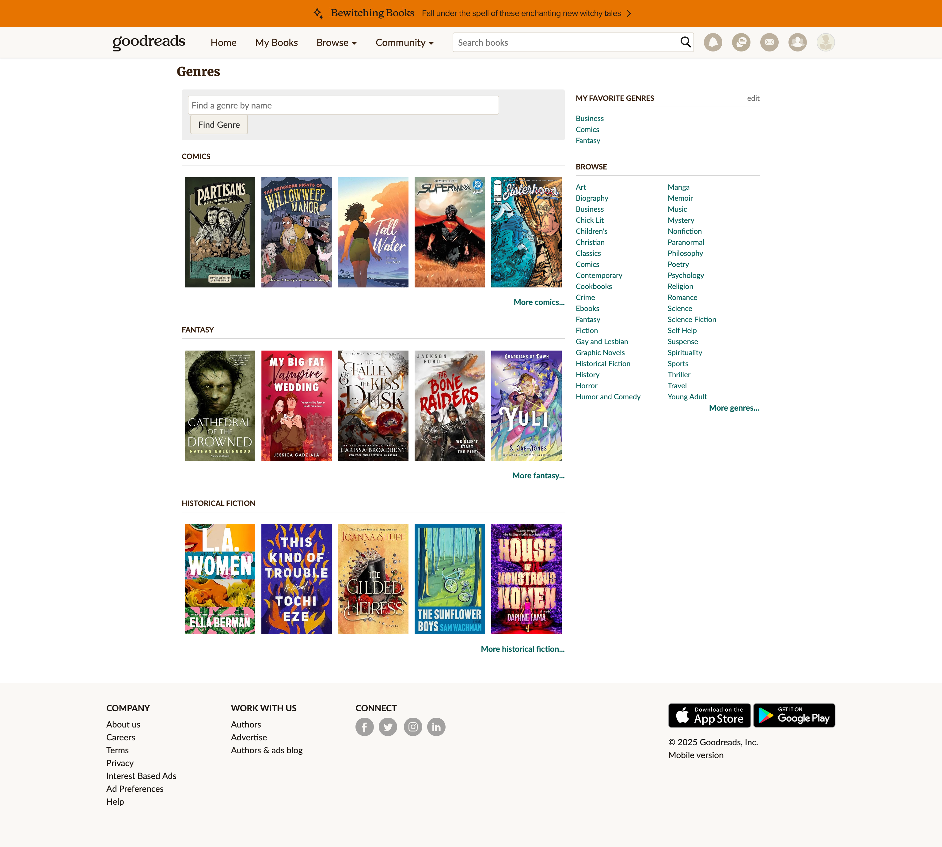 Current Genre Page
What's Goodreads?
Goodreads is a social platform where book lovers discover, track, and share their reading experiences. As a global community of over 125 million members, it helps readers find personalized book recommendations, organize virtual bookshelves, set reading goals, and connect with fellow enthusiasts—addressing the challenge of book discoverability in the digital era.
Goodreads provides comprehensive book tracking tools including virtual bookshelves ("Read," "Currently Reading," "To-Read"), a five-star rating system, and personalized recommendations refined by user ratings and habits. The platform fosters community engagement through discussion forums, book clubs, reading challenges, and the annual Goodreads Choice Awards. At year's end, Goodreads generates a "My Year in Books" summary, offering users a detailed review of their reading stats, such as total pages read and average ratings, reinforcing its role as a hub for literary exploration.
Goodreads provides comprehensive book tracking tools including virtual bookshelves ("Read," "Currently Reading," "To-Read"), a five-star rating system, and personalized recommendations refined by user ratings and habits. The platform fosters community engagement through discussion forums, book clubs, reading challenges, and the annual Goodreads Choice Awards. At year's end, Goodreads generates a "My Year in Books" summary, offering users a detailed review of their reading stats, such as total pages read and average ratings, reinforcing its role as a hub for literary exploration.
Who Uses the Product?
Avid Readers
Frequent readers seeking personalized book recommendations, tracking reading progress across multiple titles, and engaging with a community to share reviews and discover new books.
Casual Readers
Occasional readers looking to organize their reading lists, set manageable reading goals, and find books through curated recommendations and popular lists.
Authors
Writers seeking to promote their works, connect with readers through Q&A sessions, and build their audience through author profiles and promotional tools.
Book Club Members
Social readers aiming to participate in group discussions, coordinate reading schedules with friends, and engage in community forums around shared literary interests.
CHALLENGE & Goal
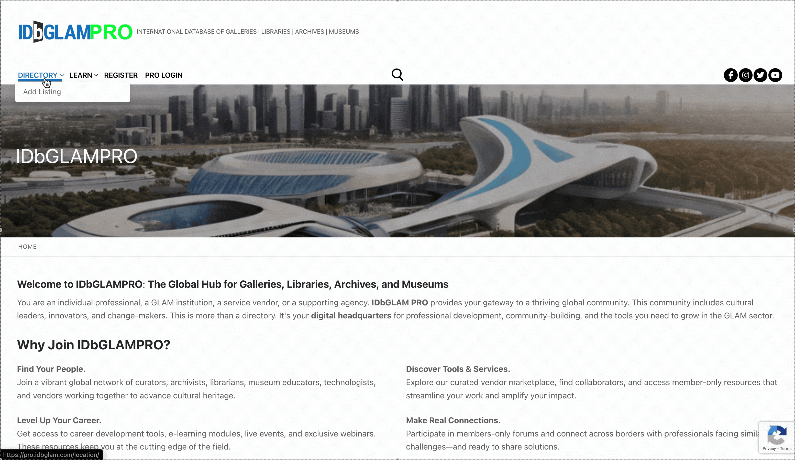 Current IDbGLAMPRO Homepage
The Problem
IDbGLAMPRO offers valuable networking resources for cultural professionals, but fragmented navigation and unclear value propositions create barriers to engagement
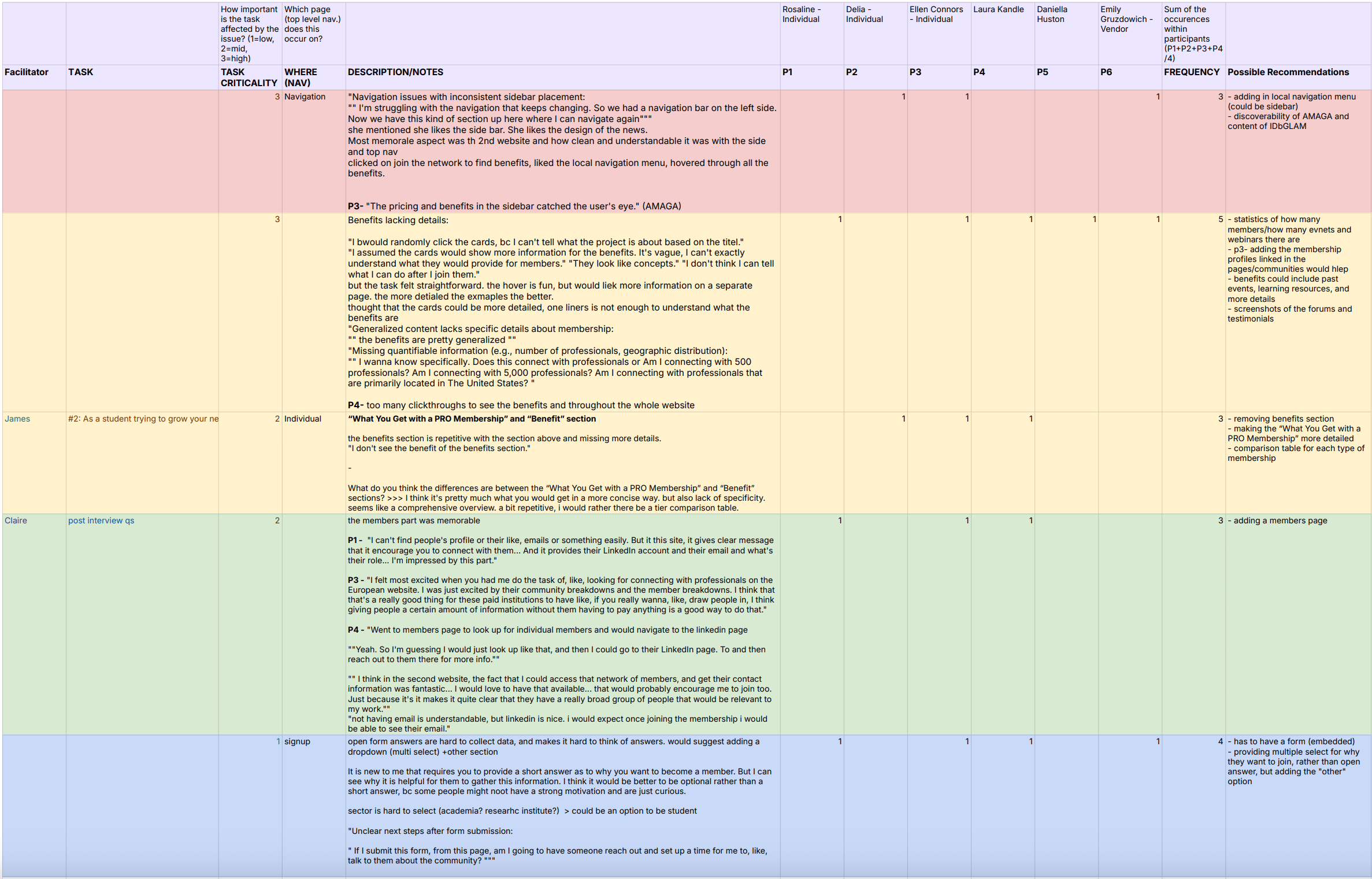
The platform's disjointed user experience obscured its core networking capabilities. Essential information like membership benefits and pricing was difficult to locate due to inconsistent navigation structure. Users encountered vague, conceptual benefit descriptions that failed to demonstrate practical value, while the absence of visible community connections made it unclear who they would be networking with. The complex registration process further compounded these issues—participants consistently struggled to understand what they were signing up for and whether the platform would meet their professional networking needs in the specialized GLAM sector.
project Goals
Evaluate User Understanding and Navigation
Assess how effectively users comprehend IDbGLAMPRO's purpose and features while identifying critical navigation barriers that prevent content discovery.
Optimize Membership Value Communication
Determine how clearly the platform conveys membership benefits and pricing compared to competitors to identify more effective value proposition strategies.
Streamline Registration and Engagement Pathways
Analyze abandonment triggers in the signup flow and develop an intuitive, progressive approach that reduces cognitive load while maintaining data collection needs.
Research
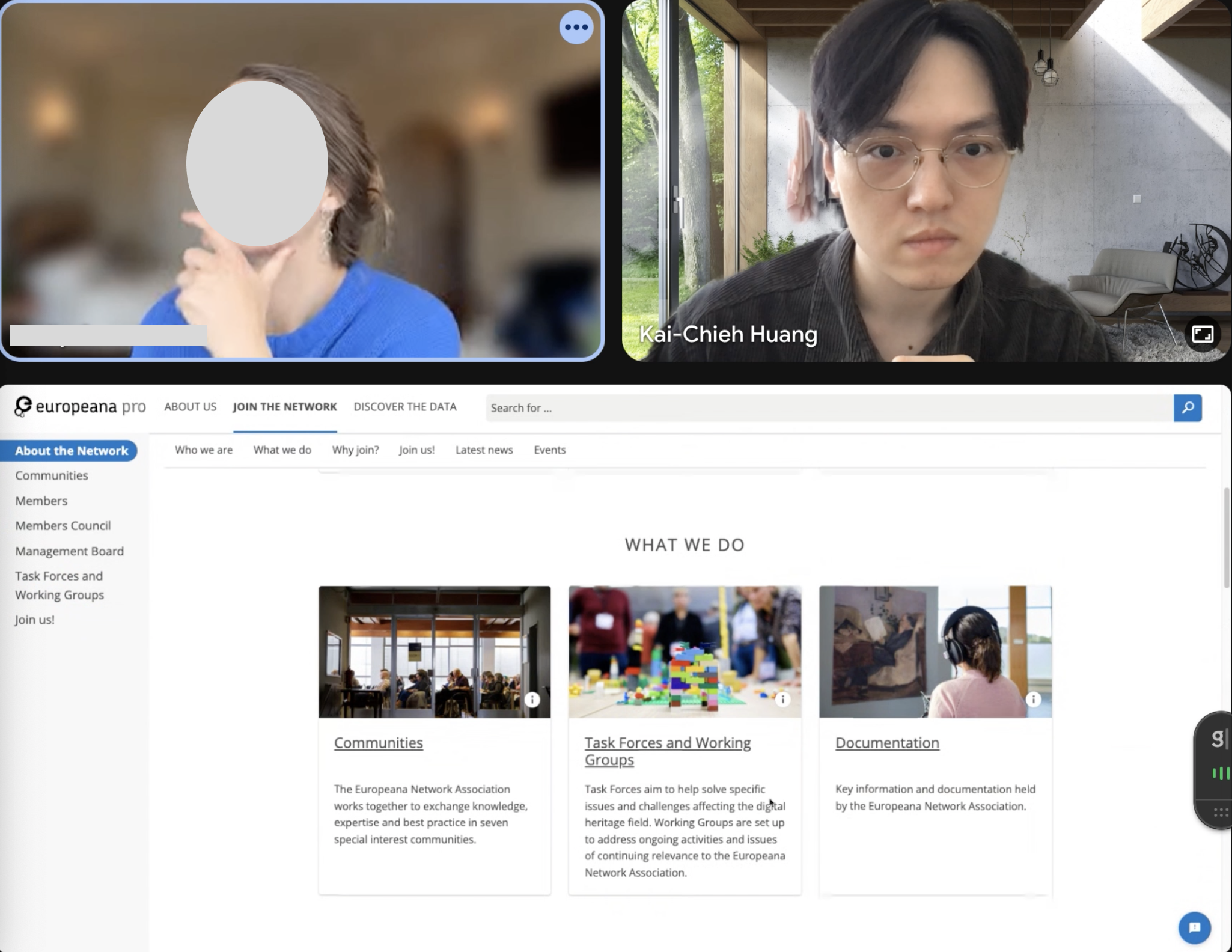
We conducted moderated remote usability testing via video conferencing with screen recording to gather real-time user reactions and probe deeper into participants' thought processes as they navigated IDbGLAMPRO and competitor platforms (Europeana PRO and AMaGA)
We recruited 6 participants from our target audience through academic networks and professional connections—1 vendor, 2 students and 3 administrators in the GLAM-related field—all with professional platform experience but no prior IDbGLAMPRO exposure to capture authentic first impressions, ease of understanding, and user expectations.
We recruited 6 participants from our target audience through academic networks and professional connections—1 vendor, 2 students and 3 administrators in the GLAM-related field—all with professional platform experience but no prior IDbGLAMPRO exposure to capture authentic first impressions, ease of understanding, and user expectations.
How did we evaluate the website?
1. Defining User Goals and User Persona
Targeted GLAM professionals with varied experience levels—students to established practitioners—all with professional networking platform experience and interest in expanding cultural heritage connections.
Focused on two key user goals:
This diverse group ensured our findings would be representative of IDbGLAMPRO's broad user base.
Focused on two key user goals:
i.
Those seeking to explore membership benefits and professional resources in the GLAM sector
ii.
Those interested in connecting with peers and expanding their professional connections for collaboration opportunities
2. Tasks Development and Test Setup
Developed a scenario where participants acted as GLAM professionals exploring the websites:
"You are a GLAM professional exploring membership options on professional platforms. Navigate through each website to understand what they offer and how you might benefit from joining. As you complete each task, please think aloud and describe your experience.”
Created 8-10 specific tasks evaluating user interaction with three platforms, focusing on value proposition understanding, membership tiers, and registration processes.
3. Moderated Comparative Testing
Guided participants through identical tasks across three platforms while employing think-aloud protocol to capture real-time reactions. Recorded sessions using screen and audio capture while asking targeted follow-up questions about navigation experience, membership clarity, and registration friction. After each task, participants rated difficulty on a 1-5 scale and provided immediate reflections on their experience.
4. Synthesis Through Affinity Mapping
Analyzed findings through team affinity mapping sessions, extracting key observations from session recordings and organizing them into thematic clusters. Identified recurring patterns and prioritized issues based on frequency and impact on user experience to develop evidence-based recommendations.
findings &
Design Recommendations Through comparative testing of IDbGLAMPRO, Europeana PRO, and AMaGA, several consistent user behavior patterns emerged that inform best practices for GLAM professional networking platforms:
Design Recommendations Through comparative testing of IDbGLAMPRO, Europeana PRO, and AMaGA, several consistent user behavior patterns emerged that inform best practices for GLAM professional networking platforms:
the general User Patterns and Best Practices Identified
1. Navigation Preferences
Users consistently gravitated toward persistent sidebar navigation systems that remained visible during scrolling, praising Europeana PRO's fixed system while struggling with IDbGLAMPRO's inconsistent structure.
Best Practice:
Persistent Navigation Architecture:
Implement fixed sidebar systems with clear section anchors for constant orientation and reduced cognitive load.
Implement fixed sidebar systems with clear section anchors for constant orientation and reduced cognitive load.
2. Information Processing Behavior
Users exhibited clear scanning patterns, seeking visual hierarchy through clickable cards rather than text-heavy hyperlinks that were easily overlooked.
Best Practice:
Visual Hierarchy Design:
Use card-based layouts with distinct visual elements that support rapid scanning over text-heavy approaches.
Use card-based layouts with distinct visual elements that support rapid scanning over text-heavy approaches.
3. Community Connection Expectations
50% of users showed enthusiasm for visible member directories, wanting to preview professional networks before committing to membership.
Best Practice:
Transparent Community Access :
Provide visible member profiles demonstrating platform value before requiring registration commitment.
Provide visible member profiles demonstrating platform value before requiring registration commitment.
4. Benefit Evaluation Approach
83% of participants required concrete examples over abstract descriptions, consistently asking for "something more concrete" when evaluating membership value.
Best Practice:
Concrete Benefit Communication:
Replace abstract descriptions with specific examples and quantifiable outcomes that clearly illustrate practical value.
Replace abstract descriptions with specific examples and quantifiable outcomes that clearly illustrate practical value.
5. Registration Completion Behavior
67% experienced friction with open-ended questions, preferring structured dropdown options and embedded forms over external processes.
Best Practice:
Structured Input Systems:
Design registration with dropdown selections and progress indicators rather than open-ended questions or external processes.
Design registration with dropdown selections and progress indicators rather than open-ended questions or external processes.
6. Cross-Platform Comparison Tendencies
Users naturally benchmarked experiences against their most positive encounter, typically using Europeana PRO as the standard for other platforms.
Finding #1
Navigation Challenges and Lack of Visual Hierarchy
Users struggled to locate essential membership information due to unclear site architecture and lack of persistent navigation cues, frequently expressing frustration when trying to find pricing details and specific benefits.
Recommendation #1
Improve Navigation Structure and Highlight Key Information
Replace the current navigation with breadcrumb trails and a fixed left-hand sidebar containing anchors to key sections (About Memberships, Individual Memberships, Members List, etc.) that remains visible during scrolling, providing constant orientation.
Finding #2
Lack of Details in the Benefits Section Affects Signup Motive
Five out of six participants cited the lack of concrete examples and specific details in benefit descriptions as a significant deterrent to joining, describing the content as "conceptual" rather than demonstrating practical value.
Recommendation #2
Enhancing the Benefits Section for Clarity and Engagement
Transform abstract benefit descriptions into tangible value propositions using visual examples, member testimonials, and specific use cases that demonstrate practical applications and outcomes for each membership tier.
Finding #3
Users Show Enthusiasm for Europeana PRO's Member Directory
Users showed marked enthusiasm for Europeana PRO's member directory, highlighting IDbGLAMPRO's lack of transparent community preview as a critical missing element that would otherwise motivate membership conversion.
Recommendation #3
Optimizing Member List for Professional Discovery and Networking
Develop a searchable member directory with filtering by profession, location, and expertise, allowing limited preview access to non-members while using strategic "Pro Only" indicators to drive conversion through demonstrated network value.
Finding #4
Registration Process Creates Friction Through Excessive Form Complexity and Format Issues
Users encountered significant friction during registration, struggling with open-ended questions and cumbersome PDF-based process that required multiple external steps.
Recommendation #4
Embedded Form Fields Create Guided Registration Experience
Create a step-by-step registration flow with progress bars that divides information into logical categories (User Type, Personal Information, Membership, Preferences, Networks, Payment), reducing cognitive load while providing clear location feedback and setting transparent time expectations for completion.
Overall
Evaluation
Evaluation
Problem space
IDbGLAMPRO users need clearer navigation, concrete benefit examples, visible professional connections, and streamlined registration to effectively engage with the platform.
Difficulty Navigating the Platform
Proposed Solution:
Revamp navigation with breadcrumb trails and a persistent left-hand menu, drawing inspiration from Europeana PRO.
Revamp navigation with breadcrumb trails and a persistent left-hand menu, drawing inspiration from Europeana PRO.
Poor Visual Organization of Membership Information
Proposed Solution:
Use bold, clickable cards for each membership level instead of basic text links. Add a comparison section to display all tiers side by side.
Use bold, clickable cards for each membership level instead of basic text links. Add a comparison section to display all tiers side by side.
Insufficient Detail in Membership Benefits
Proposed Solution:
Enhance benefits with visuals, detailed links, and member testimonials.
Enhance benefits with visuals, detailed links, and member testimonials.
Interest in Community and Networking Features
Proposed Solution:
Create a member directory with filtering tools and profile cards to enhance community engagement and peer connections.
Create a member directory with filtering tools and profile cards to enhance community engagement and peer connections.
Complicated and Frustrating Registration Experience
Proposed Solution:
Introduce a guided, step-by-step registration process with visual progress indicators.
Introduce a guided, step-by-step registration process with visual progress indicators.
Result
Impact
The impact we made with redesigned member directory and streamlined registration flow
Through our comprehensive comparative usability research, we transformed IDbGLAMPRO's fragmented experience into evidence-based solutions for cultural professionals. By identifying critical pain points in navigation, benefit communication, community visibility, and registration processes, our recommendations created a cohesive experience showcasing the platform's core networking value.
IDbGLAMPRO stakeholders were impressed by our comparative research approach and the concrete user insights we provided. They particularly valued how our findings connected specific user frustrations to actionable design solutions, especially around the member directory feature they hadn't prioritized. The team plans to implement our recommendations in phases, starting with navigation improvements and moving toward the comprehensive registration redesign.
IDbGLAMPRO stakeholders were impressed by our comparative research approach and the concrete user insights we provided. They particularly valued how our findings connected specific user frustrations to actionable design solutions, especially around the member directory feature they hadn't prioritized. The team plans to implement our recommendations in phases, starting with navigation improvements and moving toward the comprehensive registration redesign.
What I learned?
This project deepened my appreciation for comparative testing, which I rarely use in my research approach. Seeing users interact with three different platforms illuminated patterns and preferences I might have missed with traditional single-site testing. Watching participants navigate through Europeana PRO's sidebar navigation and then struggle with IDbGLAMPRO's structure gave us concrete examples to reference in our recommendations.
I became much more attuned to genuine user enthusiasm versus polite feedback, particularly when observing their excitement about the member directory feature. The affinity mapping sessions sharpened my ability to identify systemic issues in information architecture rather than focusing on isolated pain points. I'll definitely incorporate more comparative elements in my future research to better understand how interfaces align with users' existing mental models and expectations.
I became much more attuned to genuine user enthusiasm versus polite feedback, particularly when observing their excitement about the member directory feature. The affinity mapping sessions sharpened my ability to identify systemic issues in information architecture rather than focusing on isolated pain points. I'll definitely incorporate more comparative elements in my future research to better understand how interfaces align with users' existing mental models and expectations.
Next Steps
The immediate next phase would involve prototype testing of our recommended designs to validate solutions before full implementation. I'd recommend a phased approach, starting with navigation improvements and benefit enhancements while developing the more complex member directory and registration flow. Implementing analytics throughout this process would help track user engagement and conversion improvements, creating opportunities for data-driven refinements.
Long-term, I'd suggest expanding research to include post-registration experiences to ensure the platform delivers on the expectations set during the improved onboarding process.
Long-term, I'd suggest expanding research to include post-registration experiences to ensure the platform delivers on the expectations set during the improved onboarding process.